

Choosing the right window color is a big decision for your home’s design. It affects curb appeal, complements your interior and exterior, and even impacts energy efficiency. Here are five key tips to help you make the best choice:
- Match your color scheme: Coordinate window colors with your home’s warm or cool palette.
- Align with exterior style: Pick colors that suit your home’s styles and options for architecture and materials.
- Create interior-exterior flow: Ensure window frames look good from both inside and outside.
- Consider climate: Choose lighter colors in hot areas and darker shades in colder climates.
- Test samples: Check colors in natural light to avoid costly mistakes.
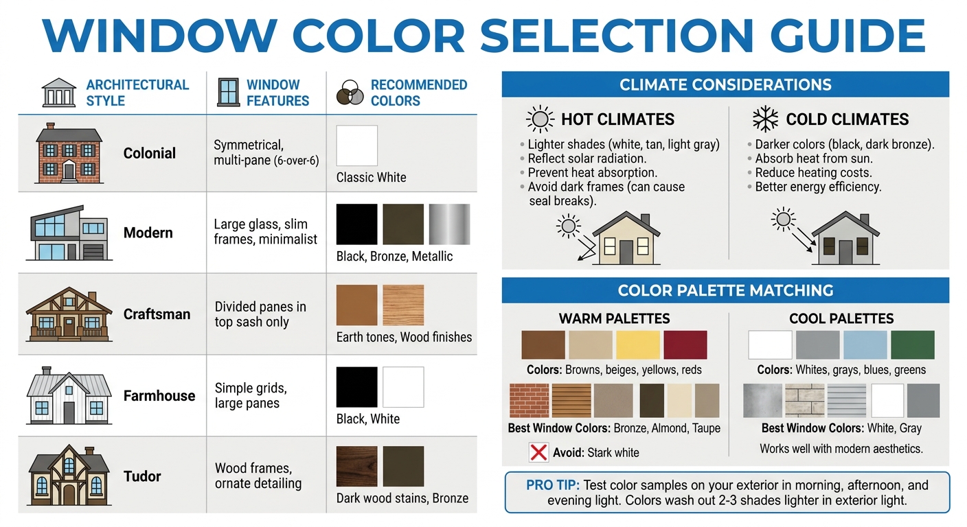
Window Color Guide by Architectural Style and Climate
1. Match Your Current Color Scheme
Coordinate your window color with your home’s walls, flooring, and furnishings by determining whether your palette leans warm or cool. A clear understanding of your palette ensures that your window color blends effortlessly with your interior design.
Identify Warm vs. Cool Color Palettes
Warm palettes include earthy tones like browns, beiges, yellows, and reds – common in materials such as brick, wood, or taupe. Cool palettes, on the other hand, feature crisp whites, grays, blues, and greens, often seen in concrete or limestone. A simple way to identify your palette is by examining the mortar in brick or stone. Green-beige tones suggest a warm palette, while green-gray hues indicate a cool one.
Maria Killam, founder of Maria Killam Colour & Design, highlights the importance of this distinction:
“White windows do NOT work when you have an earthy colour scheme with stone that is warmer and more brown and varied in tone than green grey limestone”.
For homes with warm, earthy tones, bronze or almond window frames may work better than stark white. For cooler, more modern palettes, white or gray frames often complement the design beautifully.
Use Accent Colors for Balance
If you choose bold window colors like black, they should be reflected in your interior décor to maintain harmony. Killam advises:
“Black windows can also be pretty inside, just know that you will always have to incorporate some black into your interior decor to make them relate”.
Bronze is a versatile option that works well with both warm and cool interiors. For homes with earthy tones, colors like green beige (Almond), green gray (Clay or Cashmere), or taupe create a cohesive look without the starkness of white.
White interior window frames are the most adaptable choice if you anticipate changing your décor over time. Killam recommends this approach for its flexibility:
“I always encourage my clients to choose white interior windows because timeless design means creating a versatile backdrop for decorating”.
This neutral option allows for future style changes without needing to replace your windows. Once you’ve defined your interior palette, think about how your window color complements your home’s exterior.
sbb-itb-a4eb837
2. Coordinate with Your Home’s Exterior and Architecture
Choosing the right window color isn’t just about personal preference – it needs to tie in with your home’s roof, siding, trim, and overall design. A well-coordinated color scheme can boost curb appeal and even influence resale value.
Complement Exterior Materials and Colors
Just like interior design, your windows should complement the materials and colors of your home’s exterior. You can either match your siding color exactly or create a subtle contrast by opting for a slightly darker shade. For example, darker window frames paired with lighter siding can create a sleek, modern focal point.
The color’s tone plays a big role, too. Deep, rich hues often suit rustic or ranch-style homes with wood accents, while light, airy tones are better for coastal cottages. Avoid heavy, dark colors on light, breezy architectural styles – they can overpower the design.
Don’t forget about the details! Coordinate your window hardware with the frame finish. Satin nickel or oil-rubbed bronze hardware can tie everything together and match other exterior elements like door handles or light fixtures.
Match Your Home’s Architectural Style
Your home’s architectural style should guide your window color and finish choices. For instance, Colonial homes often feature classic white, symmetrical, multi-pane windows, while modern homes lean toward large glass panes with slim, black or bronze frames. As Kevin Francis O’Gara puts it, “Choosing the right windows for your home is more than a practical decision – it’s an opportunity to enhance your property’s architectural character”.
Current trends are moving away from traditional grays toward warmer neutrals like greige, khaki, and earthy shades such as mossy green, taupe, and terracotta. Darker tones like navy blue, deep purple, and smoky black are also gaining traction for their bold, upscale appeal. Milgard notes, “Experts believe neutral colors, dark hues, and gem tones can help add a high-end, sophisticated feel to your home. Combining these shades with metallic or refined textures is one sure way to make an impression and create timeless appeal”.
| Architectural Style | Window Features | Recommended Colors |
|---|---|---|
| Colonial | Symmetrical, multi-pane (6-over-6) | Classic White |
| Modern | Large glass, slim frames, minimalist | Black, Bronze, Metallic |
| Craftsman | Divided panes in top sash only | Earth tones, Wood finishes |
| Farmhouse | Simple grids, large panes | Black, White |
| Tudor | Wood frames, ornate detailing | Dark wood stains, Bronze |
Before finalizing your choice, test color samples against your home’s exterior under natural daylight to see how they truly look. Consider your neighborhood as well – choosing colors that align with nearby homes can help your property blend harmoniously with its surroundings. Finally, ensure that your interior window selections align with this exterior cohesion for a seamless design inside and out.
3. Align Interior and Exterior for Consistent Flow
Once you’ve matched your window colors to your home’s exterior, it’s time to think about how they fit with your interior design. The same window frames visible from the street are also part of your indoor spaces, so they need to look good from both angles. It’s all about finding a balance that works from inside and out.
Consider Interior and Exterior Views
Window colors play a big role in defining both the outside appearance of your home and your interior style.
White interior windows are a classic choice. They offer a neutral, timeless backdrop that works well with almost any décor and can adapt easily if you decide to switch things up later. On the other hand, black interior windows bring a sleek, modern vibe. However, they do require some matching black accents – think rugs, hardware, or decorative pieces – to maintain harmony in your space.
If you’d like a different look for the inside and outside of your home, dual-color window frames are a great option. For example, you could go with cream or bronze for the exterior to complement materials like stone or brick, while keeping the interior frames white for maximum versatility when decorating.
You also have to think about functionality, do you want your windows to extend outward like Bay & Bow windows or would you rather have them the opposite way? Check out this brochure for some inspiration.
Blend or Contrast for Your Desired Effect
Now that you’ve thought about the views, decide whether you’d like your window colors to blend in with their surroundings or stand out as a bold contrast.
Blending creates a seamless, understated look where the windows fade into the overall design. For homes with brick or stone exteriors, tones like Almond (a green-beige) or colors like Clay or Putty (green-grey shades) can work beautifully.
Contrasting colors, on the other hand, make a statement by drawing attention to your windows’ shapes and architectural features. High-contrast combinations, like black frames against light-colored siding, are especially striking on homes with large, symmetrical, and well-balanced windows. However, as Killam advises:
“If your windows are not nice and symmetrical or consistent in shape and size, that’s when you might want to avoid accenting them with high contrast black windows”.
Inconsistent or asymmetrical windows can be unintentionally emphasized by bold, contrasting colors.
For a middle-ground option, bronze frames offer a subtle yet sophisticated look. They’re softer than black but still provide depth. Plus, darker frames like bronze can “disappear” when you’re looking out at your landscape, creating a smooth, uninterrupted connection with the outdoors. White frames, by contrast, tend to create a more defined “picture frame” effect around your view.
4. Consider Practicality and Climate Factors
When choosing window colors, it’s not just about aesthetics. Practical concerns like material durability and how well the color withstands local climate conditions are key to ensuring your windows look great and perform well over time. The right choice can save you from headaches down the road.
Choose Durable Vinyl Colors
High-quality vinyl windows can maintain their appearance for 20–40 years, resisting significant fading over time. Vinyl windows have a lot of benefits, see for yourself.
Opting for standard colors like white, almond, or clay can simplify things in the future. These colors are widely available, making it easier to find replacements or touch-ups if needed. Custom colors, while appealing, might be discontinued, creating challenges later on. As Maria Killam, a well-known authority on color, points out:
“Windows are not an easy thing to replace and they can set the entire colour palette for the rest of your exterior. That makes it an important early decision to make”.
Besides durability, it’s also essential to consider how the color interacts with your local climate.
Account for Climate and Energy Efficiency
Your climate should play a big role in your color decision. In hotter areas, lighter shades – like white, tan, or light gray – are ideal because they reflect solar radiation. On the other hand, dark frames can absorb heat, which can lead to issues. Claire, a Source Contributor, explains:
“The heat absorption of a dark color frame can cause too much expansion and break the seals between the glass panes of some types of windows”.
In colder regions, darker colors such as black or dark bronze can be an advantage. They absorb heat from the sun, which can help reduce heating costs. If you live in a dusty environment or near busy roads, mid-tone colors like gray or tan are practical choices since they don’t show dirt as easily as white or black.
If you’re leaning toward a dark custom color, make sure to check the manufacturer’s Light Reflectance Value (LRV) guidelines. Ignoring these recommendations can void the warranty on some energy-efficient windows. Companies like Vinyl Windows Co offer customizable colors that are designed to complement their energy-efficient insulated glass and advanced weather sealing, giving you both style and performance tailored to your climate.
5. Test Samples and Plan for Future Resale
Choosing the right window color is a big decision, and testing samples in natural lighting is a step you simply can’t skip. Why? Because the way colors look indoors versus outdoors can be surprisingly different. As color expert Maria Killam points out:
“Because your window color is one of the first and most expensive decisions for a renovation or new build, making a wrong choice can snowball into limiting future color decisions”.
There’s a lot of choices out there, from vinyl windows and garden windows to steel windows, choosing the “right” one can be a challenge. It never hurts to ask for a sample, get your hands on it. No worry though, if you’re stuck, reach out for help.
Getting the color right from the start not only saves you from costly mistakes but also ensures that your design choices remain flexible for years to come.
Test Colors in Real Lighting Conditions
Outdoor lighting changes everything. Colors that look soft and warm indoors can appear much lighter – and sometimes harsher – when exposed to natural light. A cream that feels cozy inside might look stark white outdoors. Maria Killam highlights this phenomenon:
“Did you know that colors typically wash out a few shades lighter in exterior light?”.
To avoid surprises, test color samples directly on your home’s exterior materials – brick, stone, siding, and mortar. Pay close attention to undertones, as many neutrals have subtle hints of green-beige or green-gray that need to complement your existing masonry. Test these samples at different times of the day – morning, afternoon, and evening – to see how the light affects them. Also, keep in mind that energy-efficient low-e glass can add a faint green tint, which might slightly alter how your chosen colors appear on interior frames.
This thorough testing process not only helps you achieve a cohesive home exterior now but also enhances your home’s appeal for future buyers.
Select Neutral Colors for Resale Value
If selling your home is in your long-term plans, neutral window colors are your safest bet. white vinyl windows are a classic choice that works with nearly every architectural style, offering what Maria Killam describes as a “versatile backdrop for decorating.” This timeless option allows future owners to update paint colors and interior decor without being constrained by the window frames.
For interiors, white creates a clean, adaptable foundation. If white feels too stark on your exterior, bronze is an excellent alternative. It’s becoming a popular option for its softer, more enduring look compared to trendy black windows. Bronze pairs well with both earthy and modern color palettes. On the other hand, avoid high-contrast colors like black if your windows are asymmetrical or vary in size. Dark frames can draw attention to these inconsistencies, which might detract from your home’s overall appearance.
Conclusion
Selecting the right window color plays a key role in shaping your home’s overall design. As Maria Killam wisely points out:
“The first and most important colour choice for your new build exterior is the window colour… your window colour choice sets the tone for the rest of your exterior decisions”.
By keeping these five tips in mind, you can create a design that’s both visually appealing and long-lasting. The right window color doesn’t just enhance your home’s style – it also ensures functionality and harmony with other design elements.
Classic shades like white, bronze, or earthy tones often work well with fixed features of your home. Meanwhile, darker frames, though trendy, demand careful thought, especially when factoring in your local climate and the balance of your window layout.
Vinyl Windows Co provides a range of customizable, factory-finished vinyl windows in shades like classic white, modern black, and versatile bronze. With options for coordinating interior and exterior colors, these windows allow you to boost curb appeal while maintaining design flexibility.
FAQs
Should my windows be the same color inside and outside?
When deciding whether to match window colors inside and outside, it all comes down to your personal style and the look you’re aiming for. Matching colors can create a seamless, unified appearance, giving your home a polished and consistent feel. On the other hand, contrasting colors can make certain features stand out or accommodate differing interior and exterior design themes.
If you prefer simplicity, sticking to the same color for both sides might make upkeep easier. However, mixing colors offers more flexibility and lets you tailor the look to your preferences. Ultimately, your decision should align with your taste and complement your home’s architectural style.
Are dark window frames a bad idea in hot climates?
Dark window frames can be a good choice for homes in hot climates when selected thoughtfully. While it’s true that darker colors tend to absorb more heat, using the right materials and finishes can help limit heat transfer. Plus, dark frames have the added benefit of reducing glare and can beautifully enhance certain architectural styles. Whether they’re the right fit depends on your personal taste and how they align with your home’s overall design.
How do I test a window color before ordering?
Testing a window color before placing an order is a smart move. Start by creating a design plan to visualize how the color will work with both the interior and exterior of your home. Use physical samples or color boards to get a feel for how the shades interact with your space, especially under natural lighting. This approach helps you confirm the color aligns with your overall aesthetic before committing to a decision.


